Matthew Dale Art / Illustration
Illustrator / Artist / Printmaker based in London, graduated from RCA in Communication Art and Design.
matthewgdale@gmail.com
Twitter
Tweets by mattgdalePortfolio
-
Posts
- New work!
- Cephalopods
- Open studio with Day Job, at Bussey Building Peckham
- Architecture; Shad Thames / Southbank
- Love Bites ‘Young Couple’
- Illustrations for ‘Love Bites’, short stories by Cliff McNish
- Editorial Commissions for New Turn Magazine
- Exhibition at The Easton, in Clerkenwell
- Poster Illustration for Art Fair
- Cheltenham Illustration Awards Submission
Blogroll
Links
Archives
- November 2014
- January 2014
- November 2013
- September 2013
- August 2013
- June 2013
- April 2013
- March 2013
- January 2013
- November 2012
- October 2012
- September 2012
- August 2012
- July 2012
- June 2012
- April 2012
- March 2012
- February 2012
- December 2011
- October 2011
- September 2011
- June 2011
- February 2011
- January 2011
- July 2010
- April 2010
- March 2010
- February 2010
- December 2009
- August 2009
- July 2009
Cephalopods
I’ve have been working on a fun new project and collaboration with an animator and writer. The story is about four characters, sea creatures, Cephalopods. Nautilus, Cuttlefish, Octopus and Squid. Each have a very different characters, from Wise to Aggressive, another sweet and the other mysterious. The story and characters are taking shape. As well as an animation I think the story would also lend itself well to a childrens book! I hope the characters and personalities (animalities) clearly match?
Open studio with Day Job, at Bussey Building Peckham
This evening myself and studio mates, Day Job are having an open studio and exhibition! Should be lots of cool work to see. Just on for one night and especially fun as we will soon be leaving Peckham and the Bussey building and moving to a new studio in Bermondsey. So it’s a leaving party too.. Farewell Bussey! Pls come down and take a look! (Below is a small detail of a new illustration I did for the show, of Shad Thames and its Dickensian past)
Architecture; Shad Thames / Southbank
This is a new series of pencil drawings. I have used the Shad Thames, Tower Bridge and the view over to Broadgate as the inspiration. Contrasting the old and new and transitional architecture there. I’ve also started to draw from location (life), outside in the elements, which has been a new challenge. The Bottom drawing is actually the Camera Building in Oxford. I’ll continue to develop this series, possibly into print and hopefully exhibit the drawings soon!
Love Bites ‘Young Couple’
Illustrations for ‘Love Bites’, short stories by Cliff McNish
Children’s author Cliff McNish, is an established and successful writer of books for young adults and children. He specialises in horror, with sometimes bizarre, intense themes, here is his website: www.cliffmcnish.com . I met him and having read some of his new scripts on relationships, emotions within them and the complications and different dynamics. For example an elderly couple who live in a world of routine, when confronted by an impulsive change of heart- to opt not to have a biscuit with an evening tea, the result is amazement and incomprehension. Another sketch features a sick man on the couch who uses the situation to effectively test his partners sympathies and patience, having her wait on him, changing TV channels, fetch biscuits and blankets, without him lifting a finger. I’m looking forward to developing the illustrations further and possibly use animation to tell the whole story.
Posted in Uncategorized
2 Comments
Exhibition at The Easton, in Clerkenwell
I currently have some work at the Easton pub in Clerkenwell (22 Easton Street, WC1X 0DS). There is a range of work, lithos and screenprints. It is situated just off a lovely street of restaurants and bars called Exmouth market, just down the road from The Medcalf where I have exhibited in the past. Please come down and take a look!
In other news I’m soon to have more work on show at some venues in South London, in Forest Hill. Also I’ve very nearly completed my new website which will soon go live and have been working on some new work for a project and exhibition with a talented illustrator friend on architecture and urban environments in London. My work has looked at the changing appearances and uses of areas in London. In particular how the function of buildings and districts has changed. Commonly moving away from industry to leisure. While many features, architectural details and the old place names remain, the function of the space and building has adapted in accordance with the modern world.
Poster Illustration for Art Fair
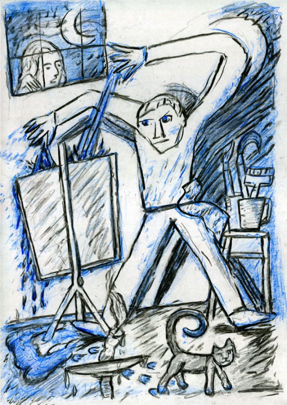
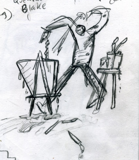
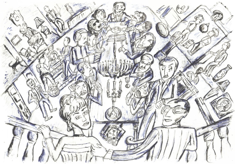
This is an illustration I was asked to do for a poster for an art fair/exhibition. I tried to make a comment on art typically produced now. With so much digital involvement and technology used in the making of work, the traditional idea of the artist producing work in the moment, messily splashing paint, might now be less common. I think blue is a colour that has been chosen by artists in the past because it can be effectively used on its own. While it is associated with being cold and stark it can be powerful, rich and effective in combination with black. Yves Klein and Picasso are two artists who used just blue to good effect. Another element of this illustration which has been possible with the use of blue is the suggestion of orange light. The blue in the shadows makes the illuminated areas from the light of the candle standout. Blue and orange are complimentary colours so while there is no orange used, the blue gives a suggestion of the colour of the warm light source. It was also important to give the image a traditional and possibly nostalgic feel. I have worked in the past with lithography and here I tried to replicate the hand produced feel and marks possible but also the way sections of colour are introduced in this old and complex printmaking medium. The print ‘Dinner Party’, below is a lithograph I made previous to this illustration. Having recently been to the London Art Fair I saw some great lithographs, including Andy Wahol’s ‘One Blue Pussy’ and ‘A Cat Named Sam’. Edward Bawden’s prints and Chris Orr’s ‘Journey To The Centre Of The Earth’ were other great Lithographs at the fair. Abstract Expressionism is another period in art that I wanted to reference. Pollock’s splash painting is referenced in the subject. Also an inspiration was the work of Max Beckmann and Otto Dix, whose simple, abstract, sometimes mechanical forms and figures were used, making gestures, actions and expressions more exaggerated.
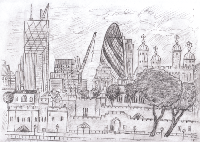
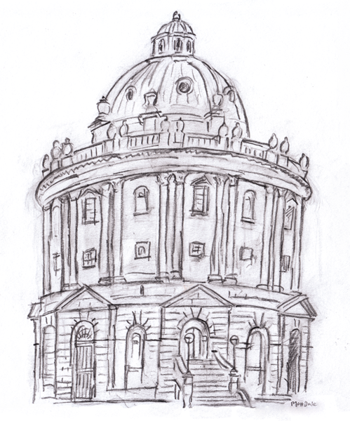
Cheltenham Illustration Awards Submission
This is a narrative I created and illustrated for the Cheltenham Illustration Awards. The brief was to come up with a narrative on the subject, ‘The tales of magical objects’. Central to the theme were amulets and charms that are believed to have a spiritual power. Another source of inspiration was the collection in the Pit Rivers Museum in Oxford, which has an amazing collection of artifacts from all over the world which go back centuries. There is a great online virtual navigation function which shows every corner of the museum and object in detail and can be found here . I definitely enjoyed working on the narrative and the subjects, I’m sure they will return in projects in the future. The title I used for this was ‘Praying For Rain’.